UM ABRAÇO & UM PÃO COM PANADO
UM ABRAÇO & UM PÃO COM PANADO
Roughly, it means “A Hug & A Fried Pork Sandwich”, which is a typical occurrence at a bar, here in Portugal.
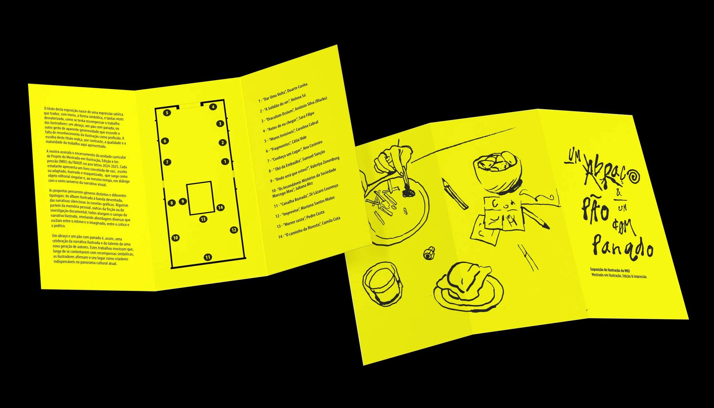
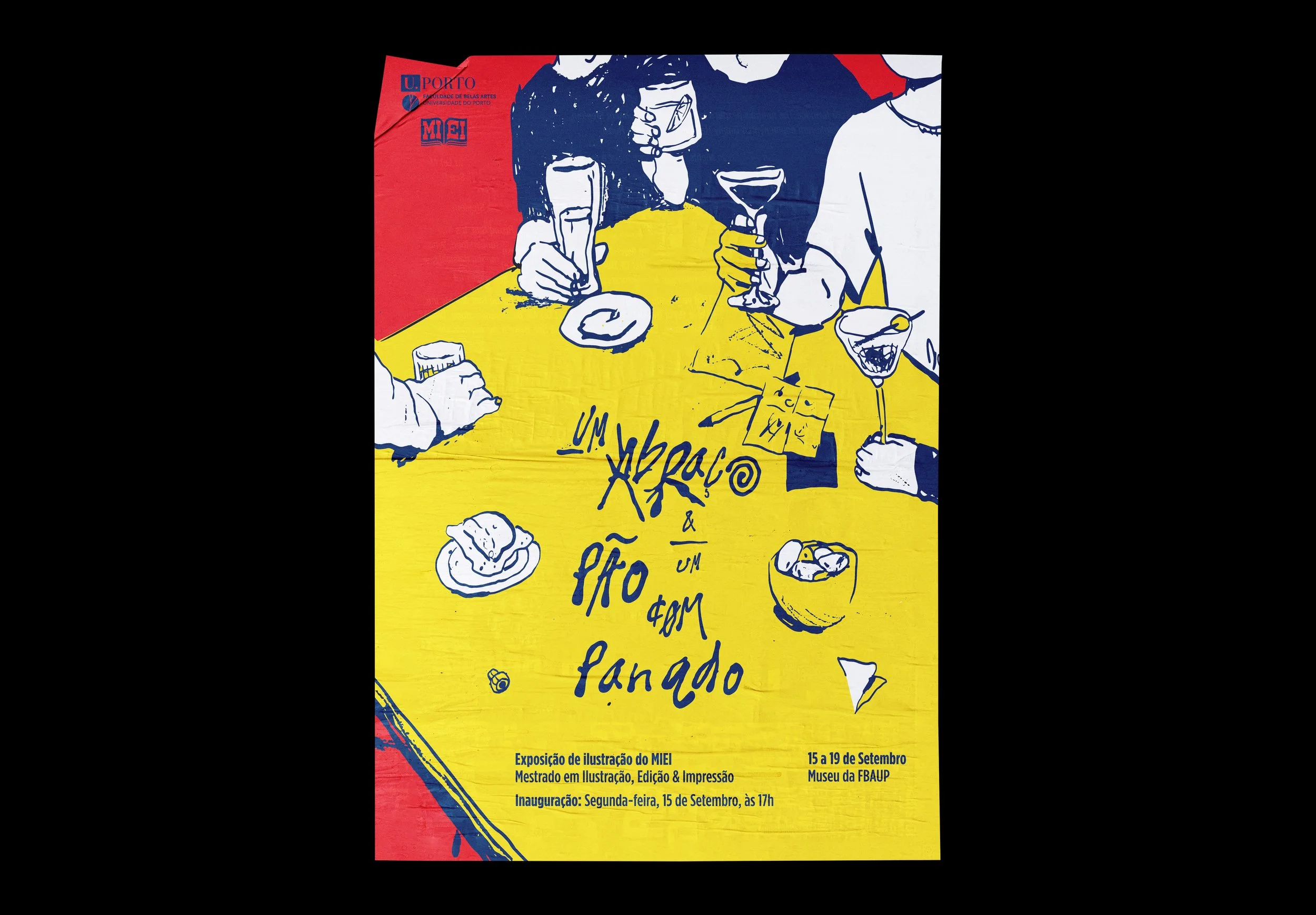
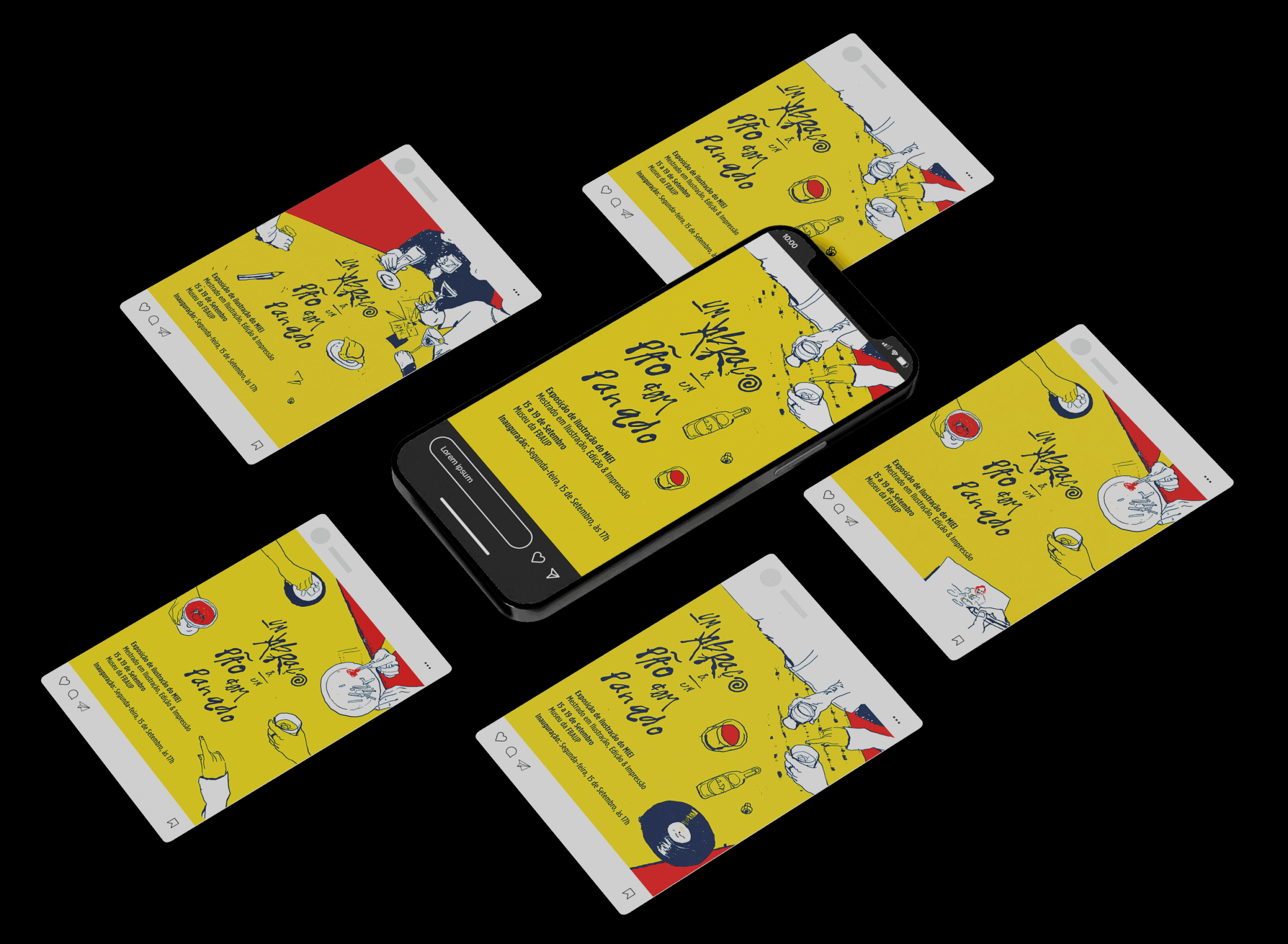
I was responsible to develop the art direction & graphic design for my Master’s class final exhibition, at Faculty of Fine Arts, University of Porto.
It was a challenging task, since my Master’s Degree is in Illustration, Edition & Print. The biggest issue was: how can I create a visual identity that encapsulates all of our distinct styles? We had children’s books, Rated R stories, and even horror. How can I create something that will resonate with my entire class? As general as it can be, but also striking and authentic?
That’s why I chose COMMUNITY.
The keyword was RESENHA.
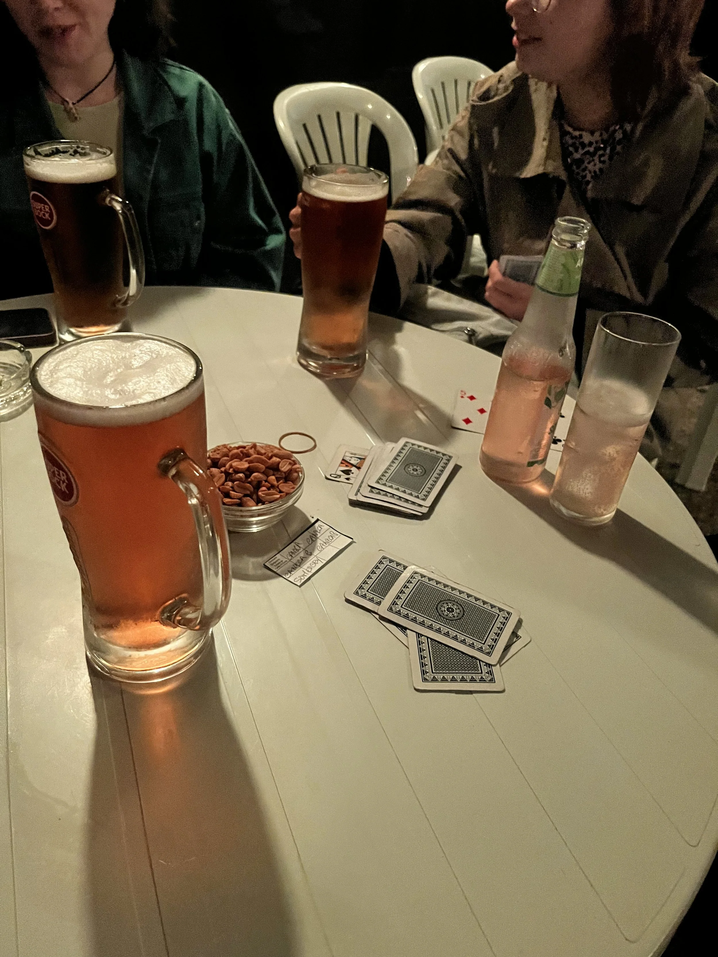
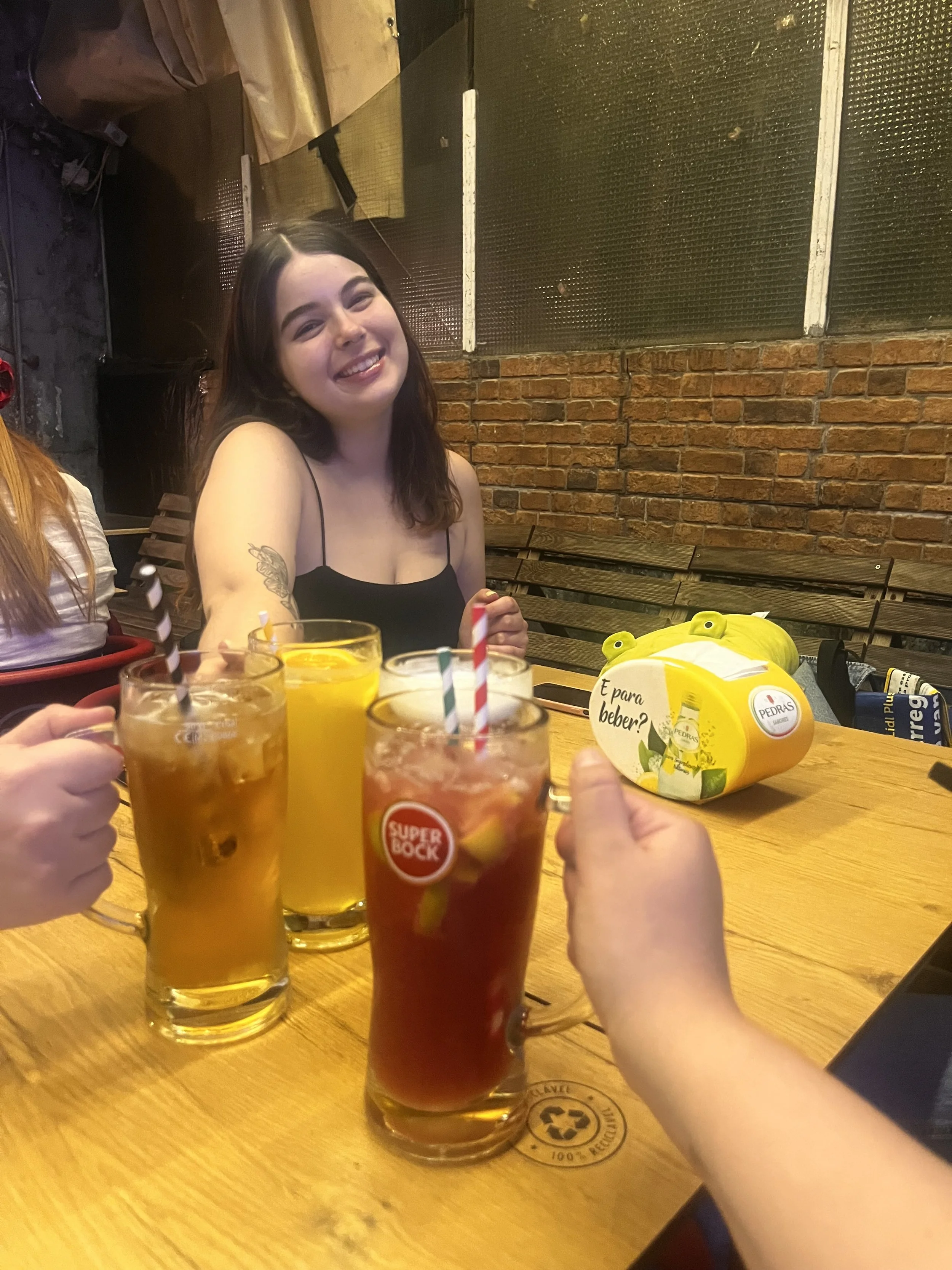
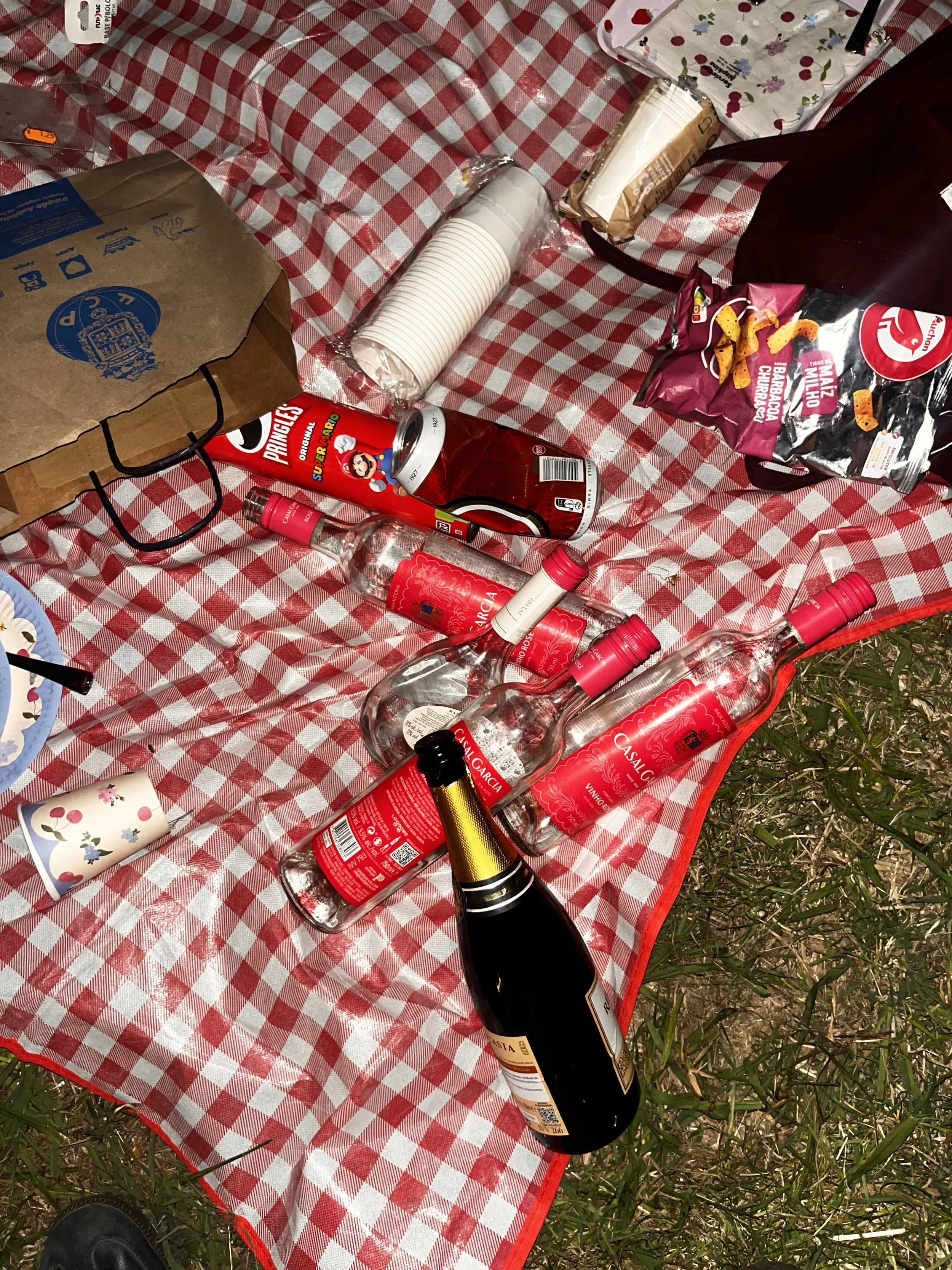
Resenha is portuguese slang for “get-together with alcohol”. It was inspired by our social gatherings after class, when we used to go to a TASQUINHA (a traditional Portuguese bar) to drink beer and share a laugh.
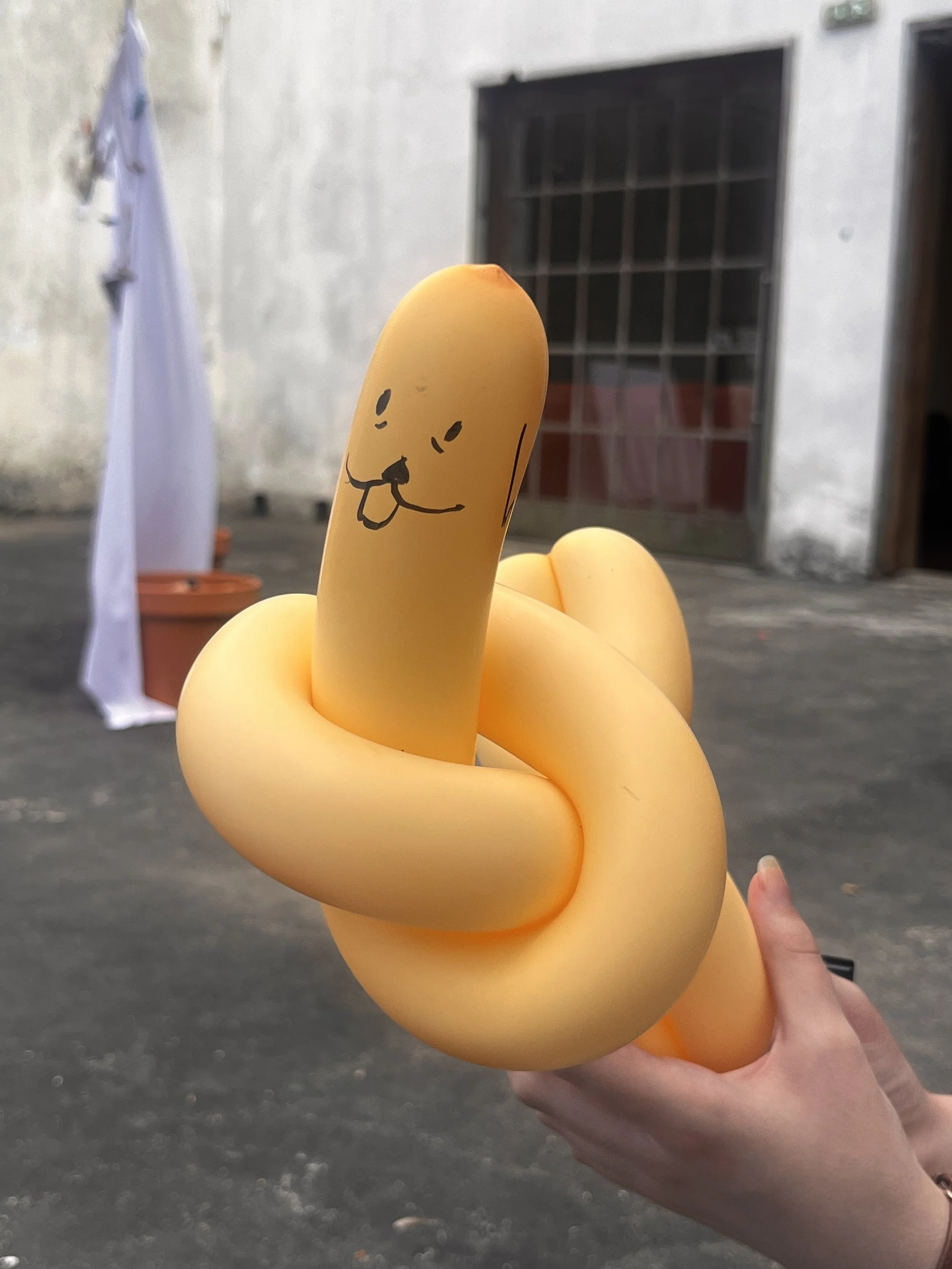
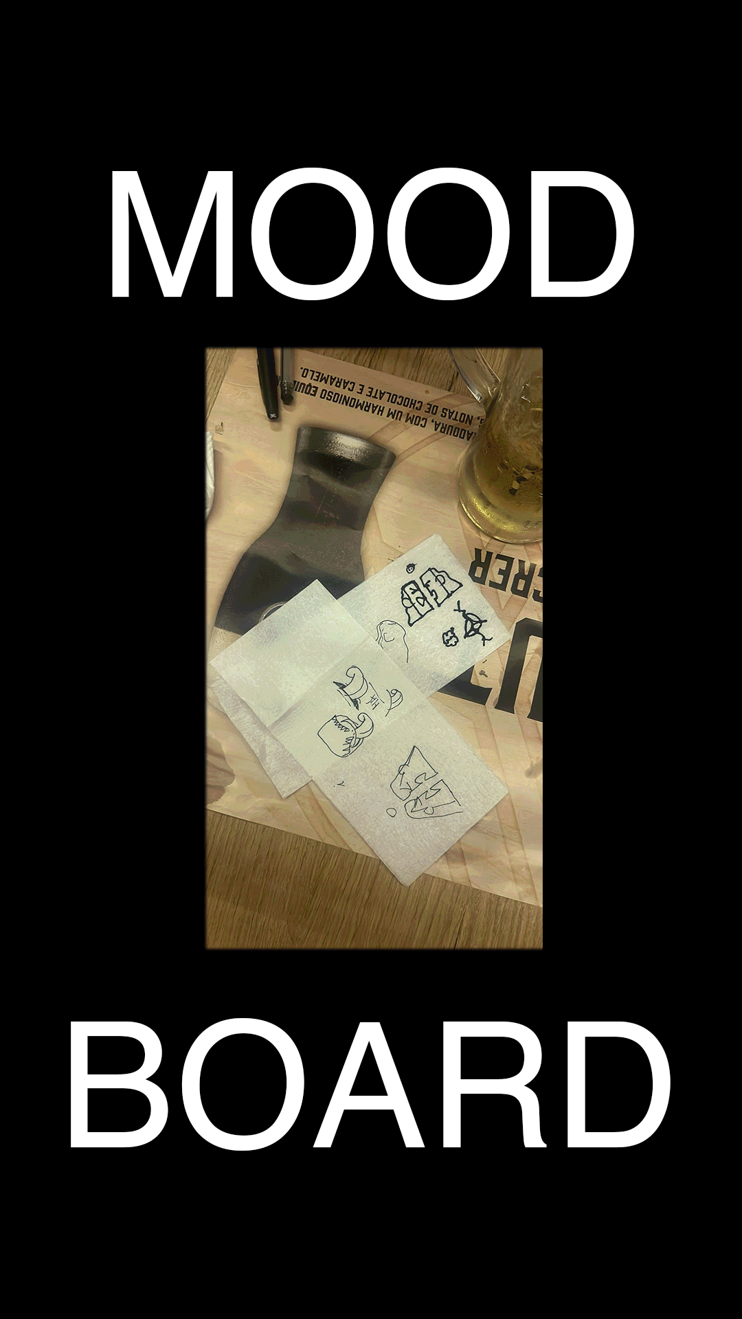
I selected a few pictures taken during our late night meetings, and created a moodboard, enhancing the chaos in our tables, with messy doodles and lots of beer.
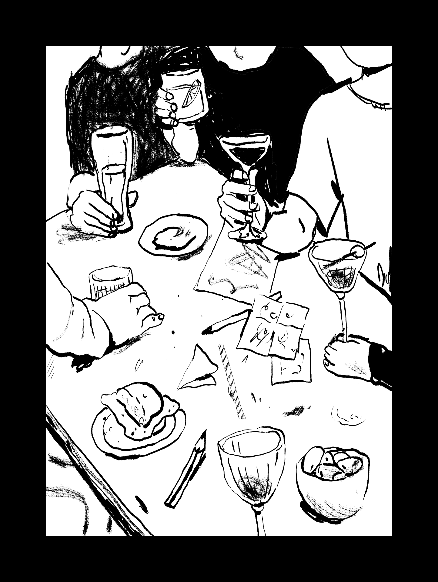
THEN, I commissioned my friend, MARIANA SANTOS MATOS.
I asked Mariana to create a set of illustrations that were “gestural, graphic and funny.” Since Mariana is often caught doing amazing observational sketches of our friends, I told her that I needed her drawings to have a “relaxed” feeling, like she was just capturing the moment as it was happening.
If you wanna see more of Mariana’s incredible work, you can find her on Instagram at both @m___saint and @urraca___

FINALLY, It was up to me.
The lettering had to be messy & ketchup-y. So, I decided to go with the Sriracha Display Regular font as a base for the exhibition’s logo.
The color palette was also taken from the moodboard: I wanted it to be warm, and to be mostly made out of primary colors - since, you know, we were all illustrators, it made sense to go back to the basics.
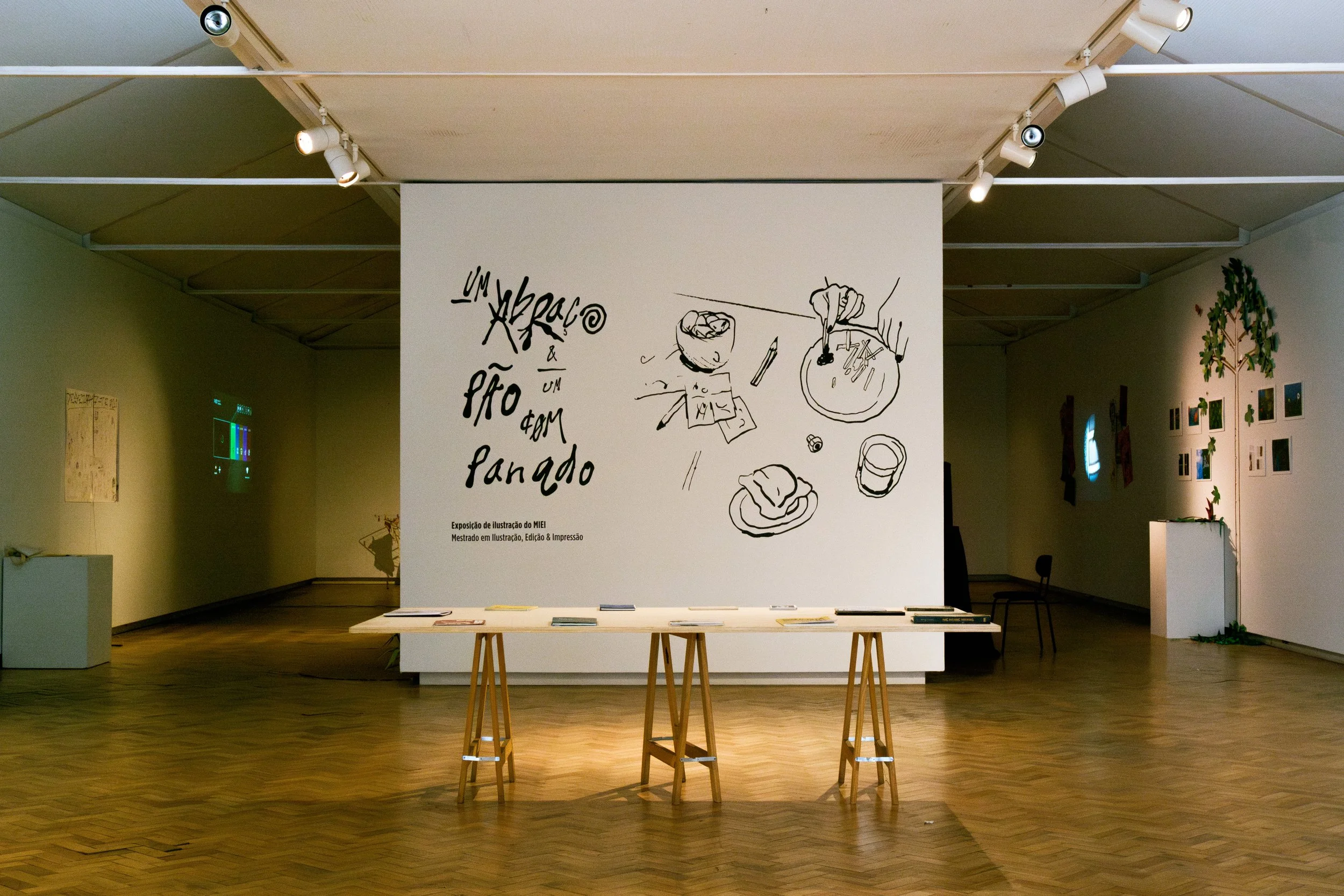
Photographer: Helena Sá
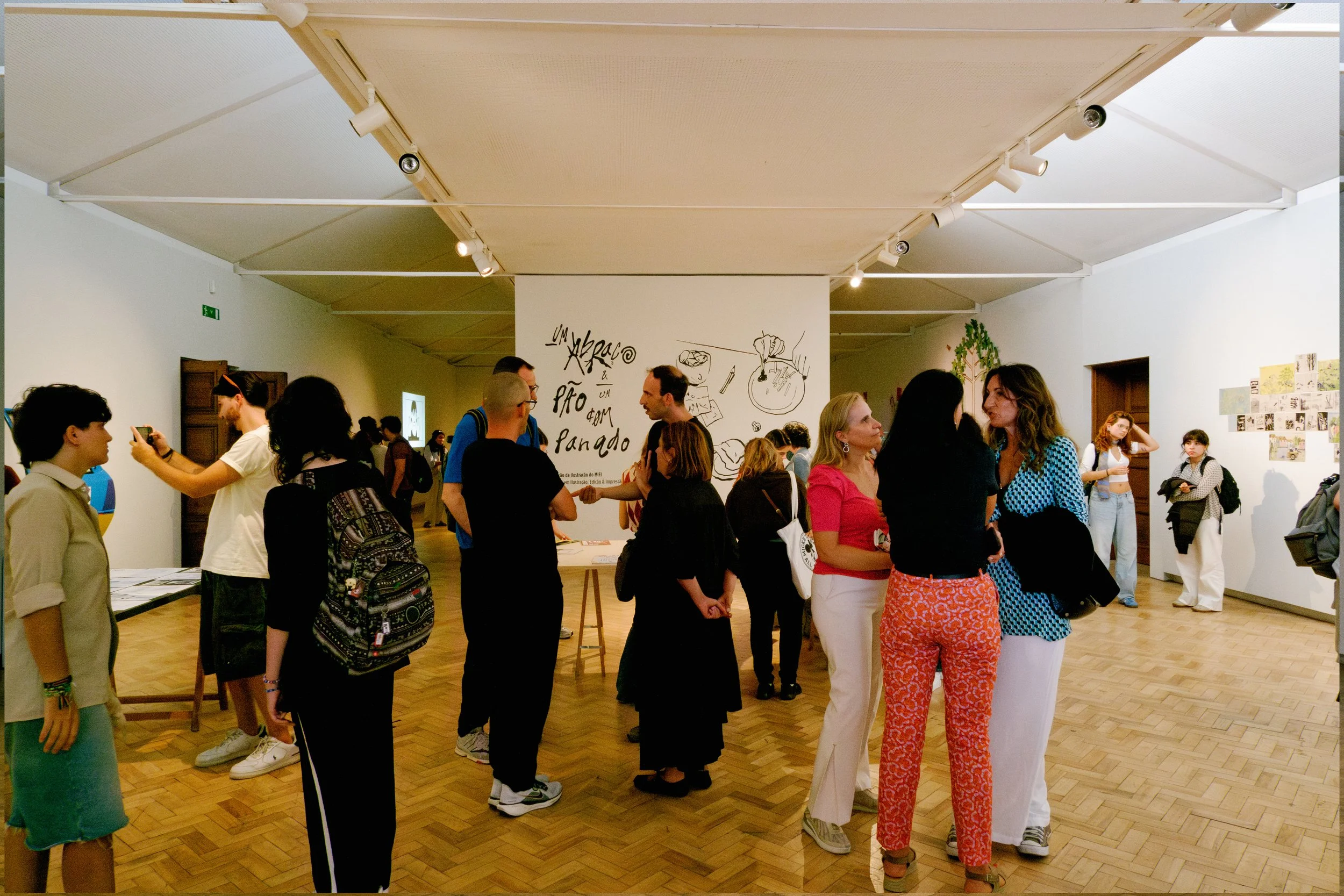
Photographer: Helena Sá